Loading Projects page
 SIAVASH KAHEENGINEERING PORTFOLIO
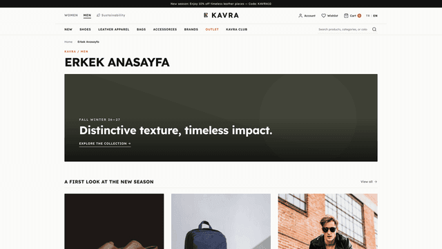
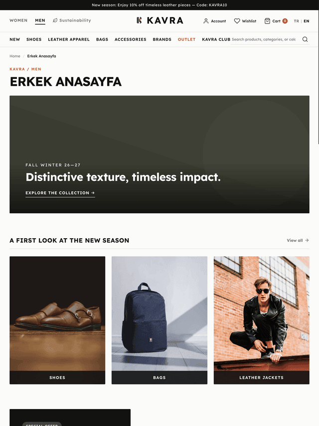
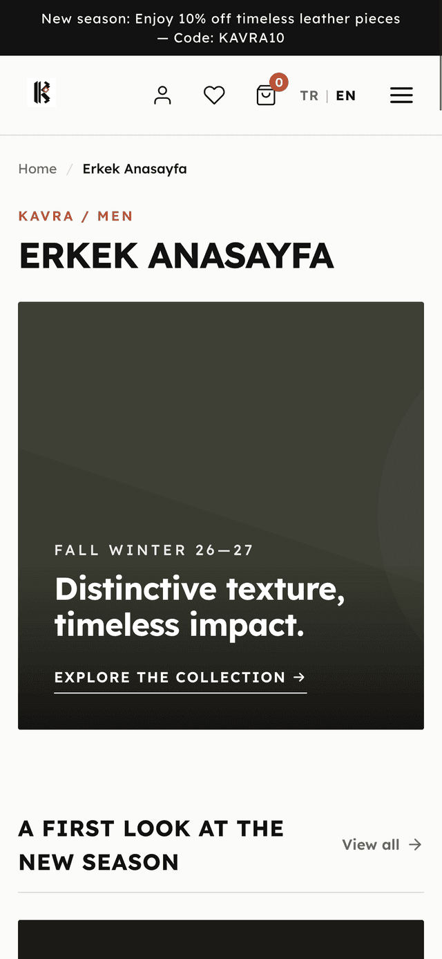
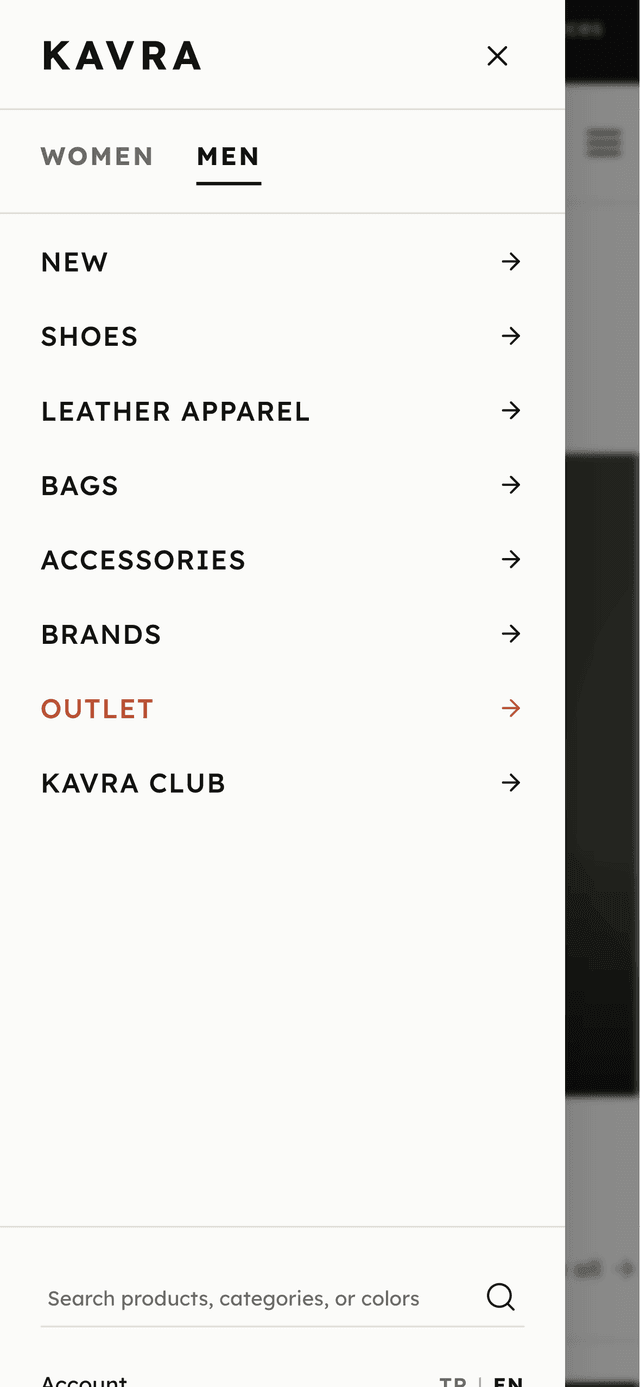
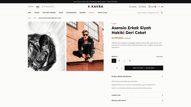
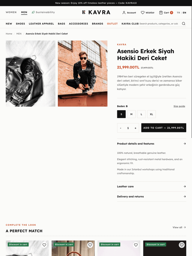
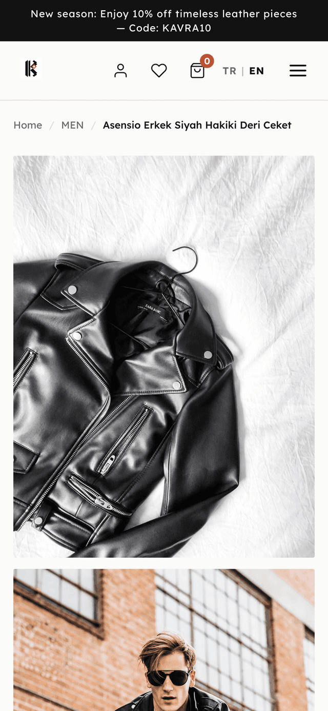
An independent Shopify theme project inspired by the fashion e-commerce experience of Derimod (featured on Holly Palm's Shopify Partner profile), built to solve intermediate tablet and mobile viewport challenges with flexible fluid grids, custom Liquid sections, and native commerce interactions.
Case studyMany e-commerce storefronts degrade at intermediate viewport widths (notably tablet portrait and landscape), resulting in broken product grids, awkward image scaling, and cramped navigation when desktop layouts are merely scaled down.
Engineered a responsive Shopify storefront built around flexible fluid grids, deliberate breakpoints, consistent editorial aspect ratios, and mobile-first navigation drawer interactions, avoiding scaled-down desktop compromises.